toranja design system
Contributing financial data components to a design system powering 160+ products inside a super-app used by 40M+ people
00
PROBLEM
Inter's Super App had outgrown its design infrastructure. Two parallel design systems were running at once. A brand refresh became the opportunity to consolidate: Toranja, a unified system with 65+ components, design tokens, and Server-Driven UI integration. I was the Senior Product Designer for the Investment vertical — the daily owner of every flow where financial charts and monetary input lived. When the DS team scoped the components most critical to financial products, they invited me as domain expert contributor. My role: make sure these components reflected the reality of the products they would power.
OUTCOMES
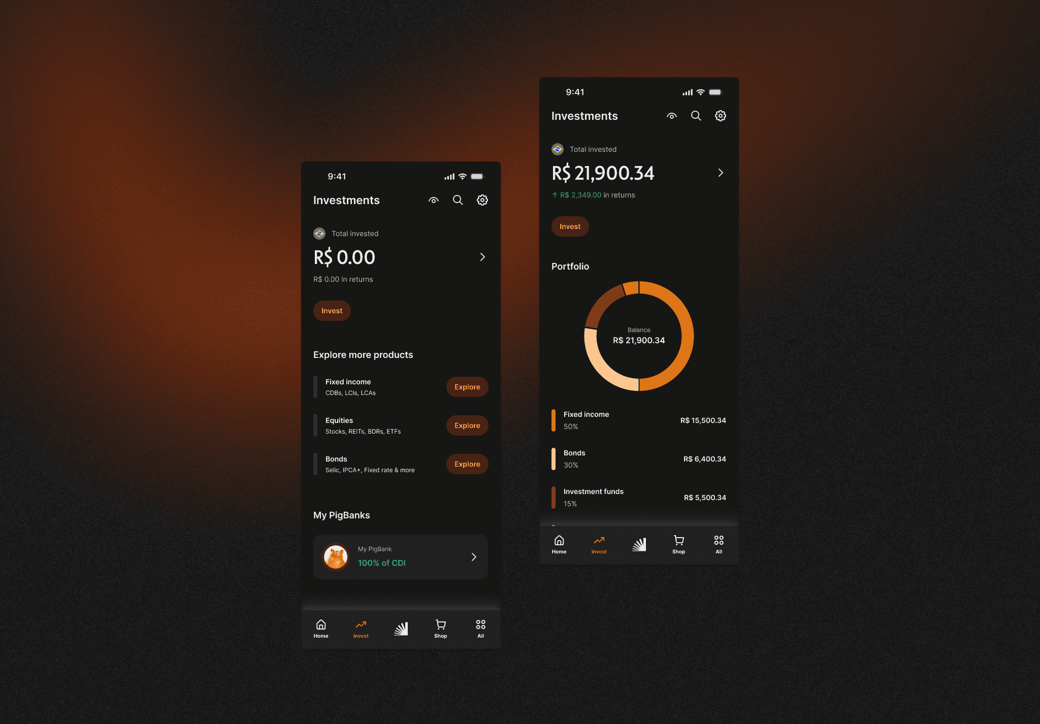
5 components shipped — Chart Line, Chart Bar, Chart Donut, Chart Meter, Input Money 160+ products across the Super App 5× faster UI changes for engineering
A component spec written from inside the DS team isn't the same as one written from inside a product flow.
Design system components for financial data carry more than visual consistency. A portfolio chart has to communicate negative performance clearly, not just plot it. Input Money has to behave correctly across dozens of transaction contexts — investments, bill payments, transfers — each with different rules.
I treated my contribution as quality gate: every state, every edge case, every interaction had to survive contact with real product use before shipping.
How the work happened
Research before specs. I ran three parallel streams: benchmarking across financial and general-purpose systems, interviews with designers from other Super App verticals, and use case analysis inside every investment flow that touched charts or money input. This last stream — the unglamorous one — became the requirements doc that anchored every later decision.
Critique sessions that stress-tested. I facilitated reviews with designers from across the Super App. Not open feedback rounds — structured around questions like "does this handle your most complex use case? where would it break in your flows?" That structure surfaced edge cases the DS team alone couldn't have anticipated.
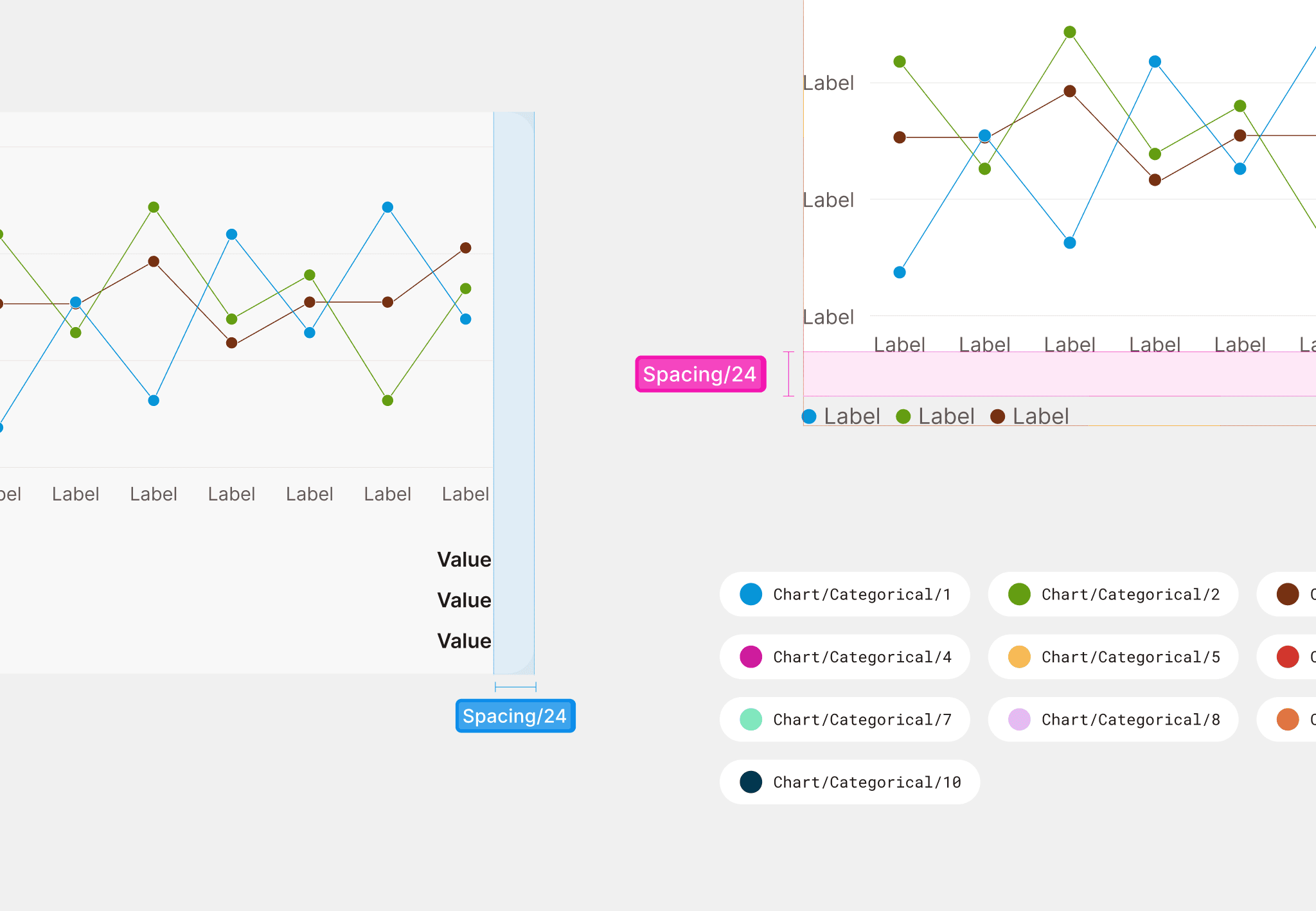
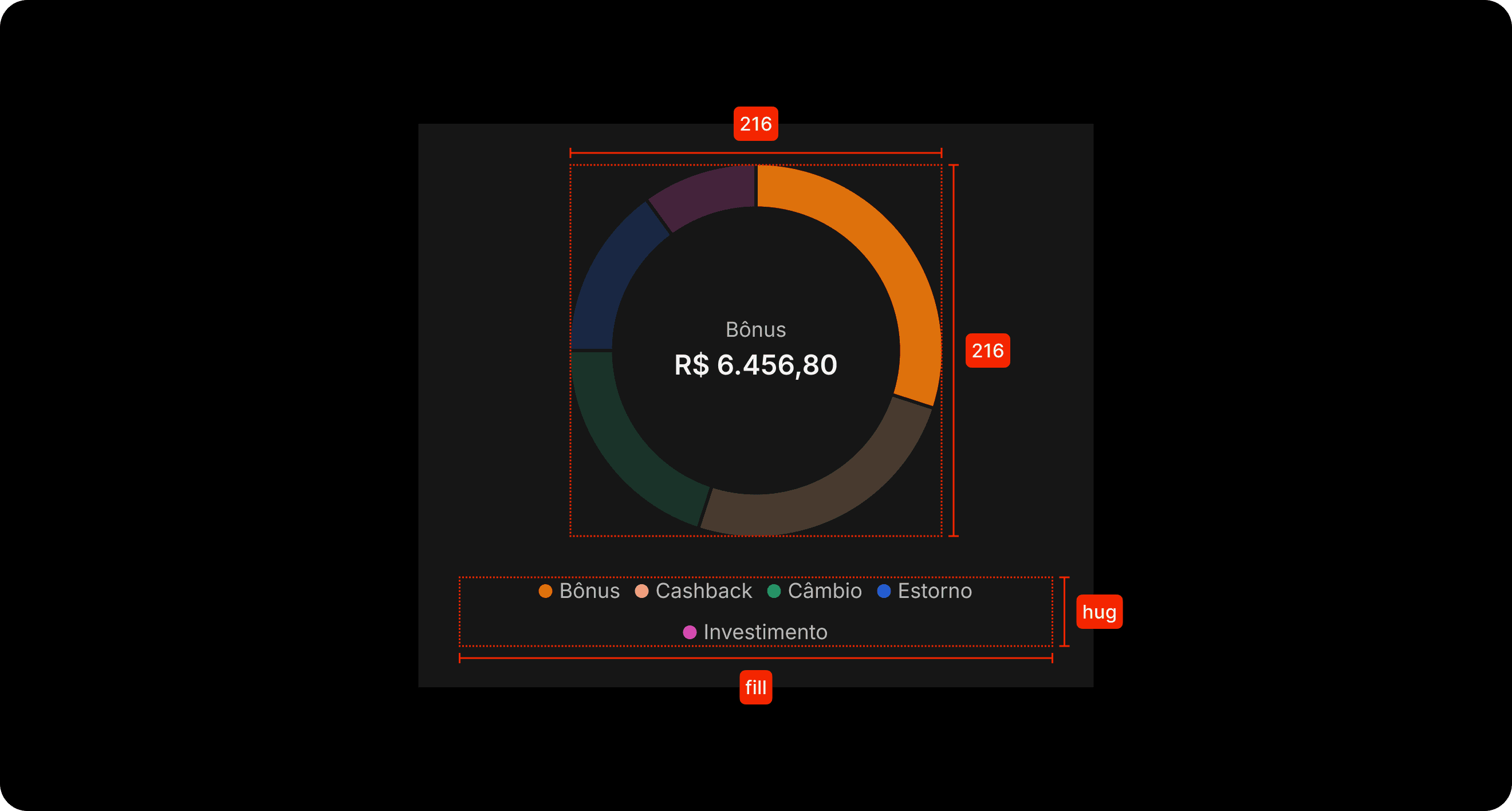
Homologation as quality control. I participated in homologation for each component with a detailed checklist: visual accuracy across all states (Enabled, Hovered, Focused, Pressed, Selected, Skeleton), behavioral correctness, token application, accessibility, documentation completeness, cross-vertical compatibility.
Components shipped
Chart Line — Trends and time-series. Two types (Basic/Granular), two sizes, multi-line support, segment-level direction indicators for negative performance.
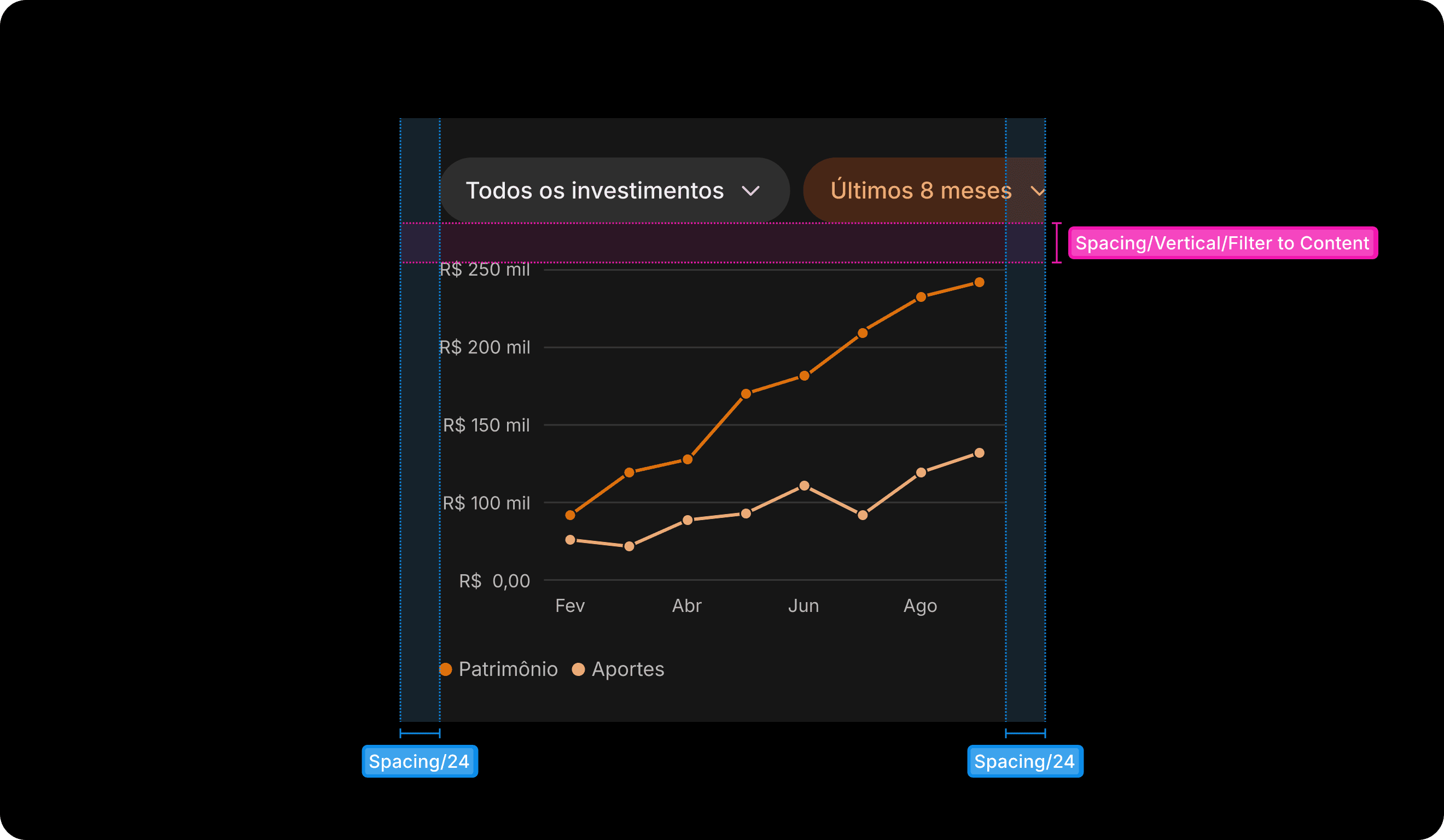
Chart Donut — Part-to-whole relationships. Asset allocation, portfolio composition. Animated segment selection.
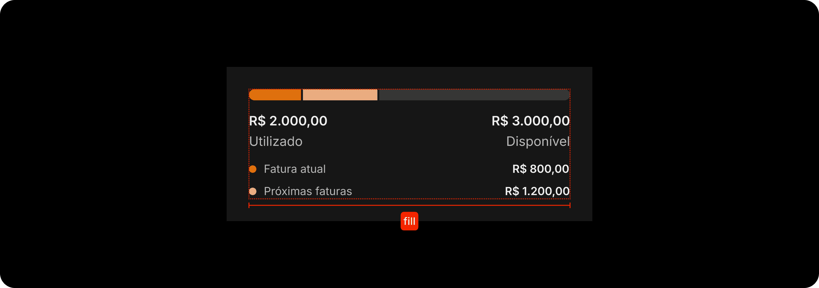
Input Money — Monetary entry across all financial contexts. One of the highest-traffic components in the system given Inter's transaction volume.


Chart Bar — Categorical comparisons across dimensions. Clear guidance on when bars are appropriate over other chart types.
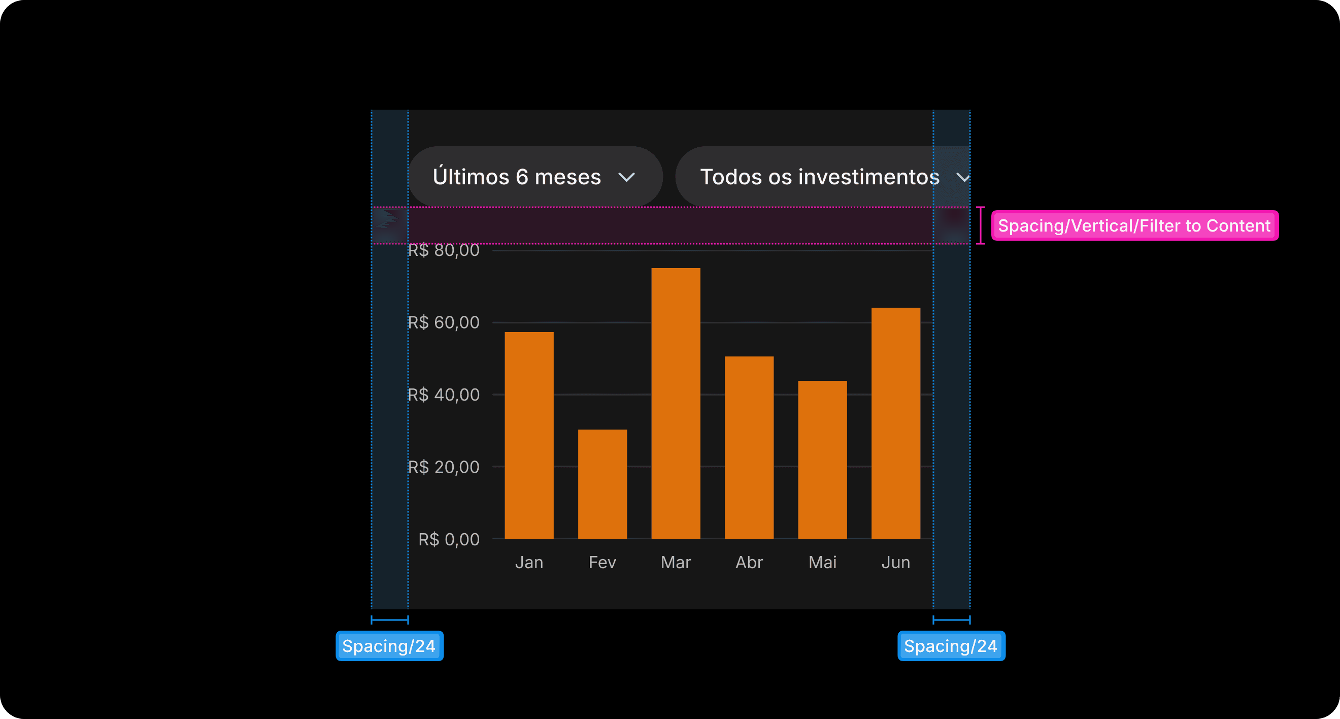
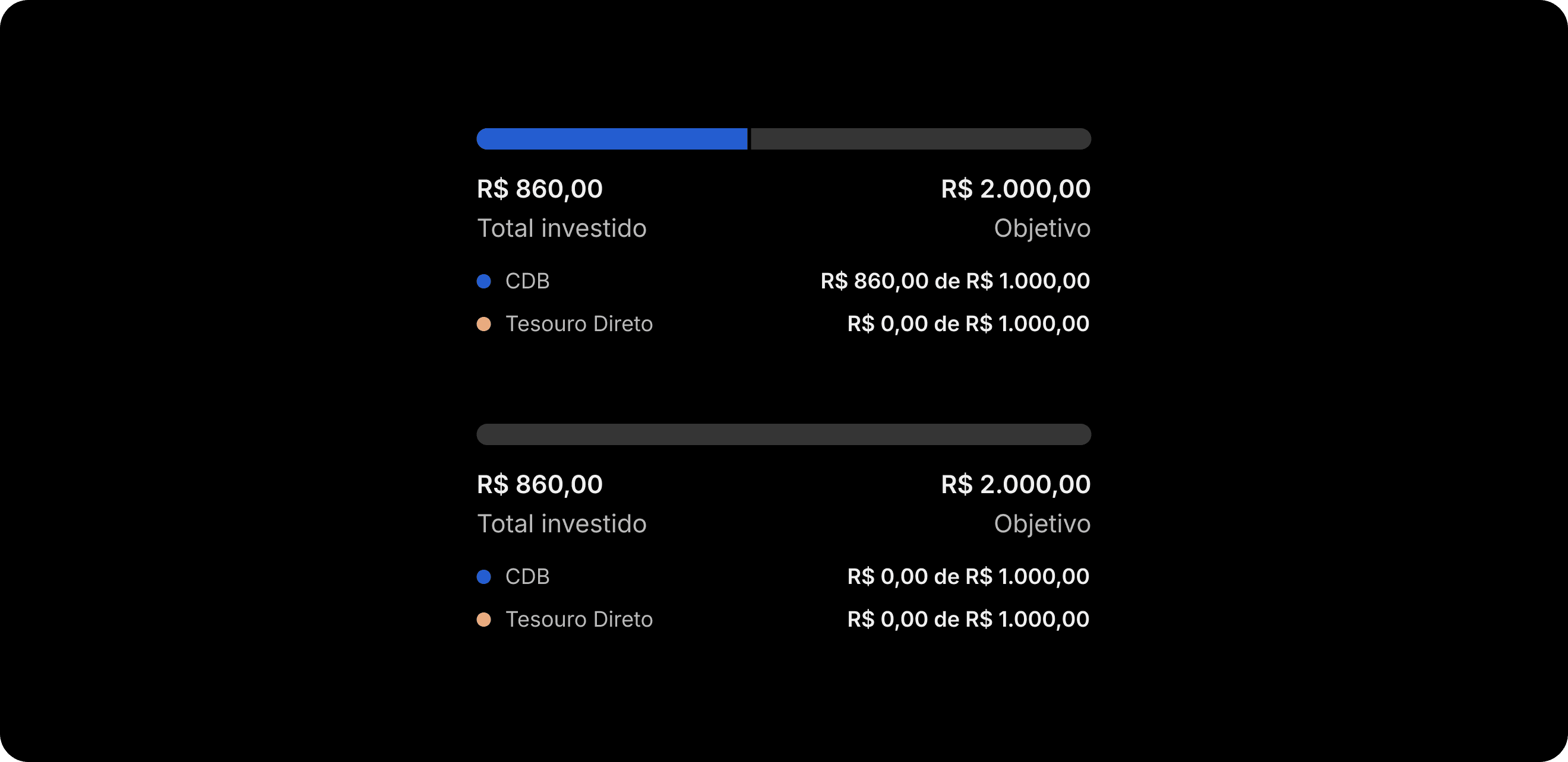
Chart Meter — Progress toward a target or performance within a range. Investment goal tracking and financial health displays.

Legend — Base component underlying every chart in Toranja. Not published for standalone use — it lives inside chart components, not independently in the interface.
Documentation
Each component shipped with documentation covering: definition and alternative names, usage guidance (when to use and not), every configurable property, every state with visual and behavioral specification, animations and interaction patterns, accessibility behavior, related components, content guidelines, and concrete use cases from real product contexts.
This became the single source of truth designers and engineers across the Super App actually used. Not a reference no one opens — a working document.
Reflection
The components are necessary but not sufficient. What makes a system genuinely useful is the quality of thinking embedded in it — what states to include, what use cases to anticipate, where to draw the line between configuration and constraint.
Contributing from outside the DS team meant carrying a specific responsibility: making sure the system reflected the reality of the products it would power. That work doesn't show up in component galleries. It shows up in the components quietly working — across 160+ products, every day, for millions of people.
YEAR
2025
COMPANY
Inter&Co.
ROLE
Senior Product Designer
CATEGORY
UI/UX
01

02

03

04

05

06

see also